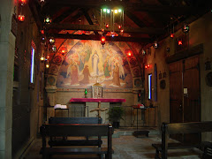
 Excellent stencilling.
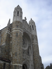
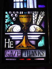
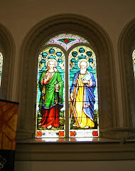
 I'd love to get a closer look at those windows. Very well made, but the arrangement is unusual. I'm curious about the subjects of the center panels.
 The font looks similar to the one at St. Alphonsus. My only problem? Another example of making the priest the center of the Mass, by the misplacement of chairs. Even so, it's better than the game of hide the tabernacle someone's played since.
Photos by Mike Doughty, by way of Alex Fries.
.png)


.png)


No comments:
Post a Comment