 Not bad, at all. In fact, the exterior's rather good. I like the way that center section rises above the rest. Interesting treatment of the roof, below it. A nice design.
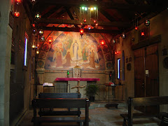
 Inside, again not bad. The floor looks fantastic, nice windows, and I like that ceiling. Altar area's a bit bland, but that's easily fixed. I don't usually care for jacuzzi-style fonts, but this one's actually very nice. Good work!
.png)


.png)


1 comment:
The font looks like a Kohler commercial ;-)
Post a Comment