 Kevin Hammer was kind enough to send me some photographs he took of St. Joseph's, along with a page showing its predecessors. The picture above, on the right, shows the church as it was built, in 1861 to 1862. In general, it was pretty much in keeping with the German-influenced buildings in the diocese. The top of the tower shows a lot of individuality, however, in the belfry with it's little buttresses. The spire was 180 feet tall. Notice the circular opening about midway up the tower? It had a Seth Thomas tower clock.
 As so often happens in these parts, St. Joseph's was heavily damaged by fire, in 1934. Only the walls and the sanctuary survived. The clock was a serious loss.
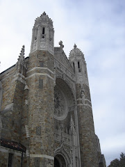
In rebuilding, a new facade was added, apparently extending out in front of the old one. You'll notice how it's in front of the tower? Now look at the old picture and you'll see the difference. A lot of useful space added, there. The design is very much in the Gothic of the period. At the time, stonework, sometimes concrete imitating stone, was often used to accent doors, windows, and the corners of the building. It's used quite effectively here. The stepped effect around the door and mounting to that wonderful window is excellent.
 It's hard to tell how much of the tower is original and how much was rebuilt. It kept the same basic pattern but with the addition of some decorative work at the top. I'm glad they built a new spire. Often in cases like that you end up with flat-roofed towers. That rarely helps. The open space does make you regret the loss of the clock. You'll notice the front addition has gabled projections at the side. Nice touch. It even manages to blend right in with the older walls. There's also a flat-roofed wing along the side that manages to be unobtrusive. I'll have to see if I can find out who the architect was. He knew what he was doing.
.png)


.png)


1 comment:
Jeffrey,
"He knew what he was doing."
Of that, there is no doubt.
Excellent save!
Post a Comment