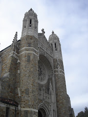
 This was a very good design at one time. The spire added a much needed vertical focus and the little turrets softened the rather angular corners. The color contrast between tan and red stone is a good touch.
 I'm afraid it's been badly handled. The removal of the spire and turrets make it look squat and boxy. That tower cap is a disaster.
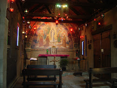
I've been told the interior is done in shades of orange. Let's wait until I have pictorial evidence. Hard to believe anyone could do something quite that stupid.
Photos courtesy of Alex Fries.
.png)


.png)


1 comment:
i've got your proof...just not on the internet yet. haha
Post a Comment