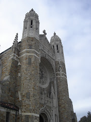
 The picture's not the best, but it does show some of the best points of this design. What strikes me most is the tower. Notice the tapering effect. I think the picture probably exaggerates it just a bit, but the buttresses widen it noticably at the base and the belfry area appears to be just a bit smaller than the lower parts. The arrangement accents the height of the tower. Those little round windows are a nice touch, too.
The next thing I notice is the color of the stone. Seems to be a beautiful tone. I'm going to have to do a bit of research on where the stone used in Northwest Ohio came from.
Third, the entrances. Hard to tell from the picture, but there seems to be a gable, with finials on each side, over the one in the middle. Good touch. It gives a good focal point to the facade and accentuates the whole purpose of the thing. Hic est Domus Dei et Porta Caeli.
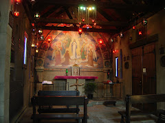
Finally, I posted pictures of the interior yesterday ( HERE ). I wasn't feeling all that well, at the time, so I'll mention a couple things that I left out. First, the vaulting seems to be in a very interesting and unusual pattern, especially toward the back wall around the small apse. Another good feature is the two doors to the far right and left of the top picture of the interior. I like them. Perfect shape and the surrounds look good. One other item has me curious. The choir loft in the lower picture. Notice those nice vaults under it, then the square posts in front of them. I wonder if there's been a change at some point?
.png)



.png)


No comments:
Post a Comment