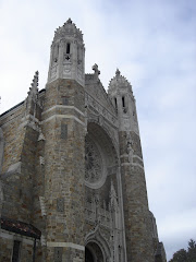
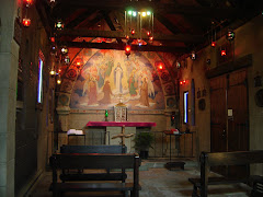
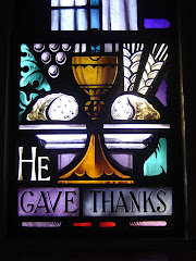
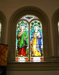
 Not bad, at all. In fact, the exterior's rather good. I like the way that center section rises above the rest. Interesting treatment of the roof, below it. A nice design.
Subscribe to:
Post Comments (Atom)
A tribute to the treasure trove of ecclesiastical art and architecture in the Diocese of Toledo.
.png)


.png)


1 comment:
The font looks like a Kohler commercial ;-)
Post a Comment