I've been going through the diocesan website, which is excellent, looking for parish websites. The results are discouraging. Most don't have them. Some seem to have started them and lost interest. A couple of the links on the parish section of the diocesan site lead directly to advertising sites that have nothing to do with the parishes. When, lo and behold, I actually find a site, it's a mixed bag. Some are very good, some competant, some completely awful.
Let me tell you something. The internet, like it or not, is your first line of outreach. Someone new to the area is likely to go there first. If your parish doesn't have a website and the one next door has a good one, what do you think will happen? And another thing, I found some sites that bent over backwards to talk about how welcoming and open their "communities" were. Guess what? They're among the worst. They're usually poorly designed and boring as all get out. All that yapping is just going to drive people away in sheer boredom. Others just list events and news. Good, but don't forget to update. Your bulletin from September is not all that interesting in December. But at least they're all trying.
I attribute a lot of this to what I call The Toledo Time Warp. When I moved here, it was like stepping back in time. I felt like shouting "come on, people! Wake up. The sixties are over and so are the seventies." Building a website is not a terribly difficult thing. I had very little knowledge of computers before I started blogging this year. My family basically ignored the 20th century and was a bit uncomfortable with the 19th. I'm not, by nature, a technophile. Far from it. But look at what I'm doing here. Any parish has someone who can get the ball rolling. Get the youth group involved. If you don't have a youth group, don't bother. You need to concentrate on correcting that first. But do something. It's the beginning of the 21st century and opting out is no longer an option.
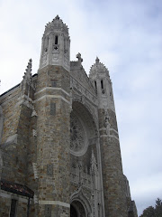
What should a good parish website have? Absolute minimum: 1. A good picture of the church building. A nice building is a priority for most people these days, contrary to what we all heard spouted in the seventies. If you have an ugly building ( And, oh, my, some of you do! ), use a good picture of some detail. Whatever looks beautiful. 2. Location, Mass schedule, office contact information. This is not negotiable, but some people forget anyway. 3. Everything else is just bells and whistles. Those are the essentials.
And, please! Skip the high-faluting "mission statement". We're all Catholic, we're supposed to know the Church's mission. Most people coming from out in the real world feel that way, at least. If this offends anyone? Too bad, you need to hear it.
Subscribe to:
Post Comments (Atom)
.png)


.png)


No comments:
Post a Comment