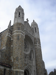
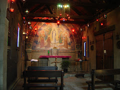
 I'm sorry, but the only thing I can say is "oh, shit!" A magnificent church, and right in the middle is this mess. I hope they didn't pay an architect to design that back wall. Looks like a do-it-yourself job, and worth the price, if the price was nothing. Those fake arches just succeed in adding insult to injury. The peach colored paint, in the apse, throws the whole thing out of whack. I'm not surprised at all by the presence of a "resurrifix", AKA "Crucifixion denier". After all, we can't have the cheery message of that rhythm section ( Must be a terrible distraction, right behind the altar ) being spoiled by remembering that Our Lord died for our sins.
I can say three good things here. First, the altar is beautiful. Wonderful piece of stone. Second, the stone paving that brings it out where everyone can miss the Mass while looking at all that activity behind the priest, is very good. Third, it would be very easy to rip the whole ridiculous waste of money out and put in something not quite so old-fashioned. Young people, nowadays, like their churches to look like churches.
.png)


.png)


2 comments:
I see the "(less than) handyman" style (for lack of a more descriptive and appropriate term).
Looks like a very sore thumb :-(
The good news, it's repairable.
I wouldn't mind being the one to take a sledge hammer to it, but I'm past the ability to do it.
Post a Comment