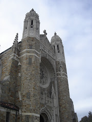
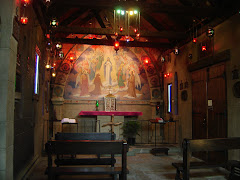
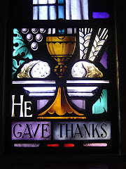
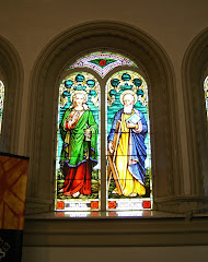
Overall, i must say i love the colors of this church. Judging by the pictures, the church could use better lighting, especially to bring out all the golds and blues.
Photo's courtesy of Ben Russell.
Photo's courtesy of Ben Russell.
A tribute to the treasure trove of ecclesiastical art and architecture in the Diocese of Toledo.
.png)



.png)

4 comments:
Yeah they could use some more lights than the mercury vapor ones they use. But, I also say some of that's from my lack of knowledge of the camera...
I like to say this church is like a small version of the Cathedral.
-Benrr101
Surely this is one of the most beautiful churches in the diocese! (At least, on the inside.)
Perfect. I'll have to find out who did those murals.
Phenomenal!!!
Post a Comment