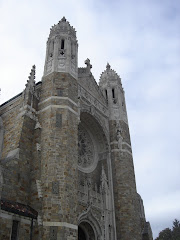
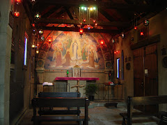
 I won't even identify it. "Noble simplicity" was never intended to mean sterile as an operating room. A drab, gray wall that dwarfs that resurrifix. Furniture that looks like it came from Ikea. Dull carpet that looks like any institutional waiting room. It's a disaster. The parishioners probably fall asleep.
There is absolutely no excuse for a church to be this ugly. Interestingly enough, the parish is considering building a new church. Why bother? They already have a blank slate. The exterior is actually rather interesting, in a box-like sort of way. Just gut the place and invest in some decent fittings. Better yet, put some of the artwork that's sitting in storage to good use. Anything would be an improvement over this.
.png)


.png)


4 comments:
Furniture that looks like it came from Ikea.
I just read this comment, and I can't stop laughing. Good turn of phrase. :-)
I'm having the same reaction after a quick look at your blog, too. I'll look in later when I have time to enjoy it.
OMG ... and I haven't even sent you the photos I took on New Year's Eve yet!! Needless to say, I recognized this IMMEDIATELY. Unfortunately ... I've wondered myself why they ever had to go with something like this. I still have a hard time feeling like I'm in church when I'm in there. What they'll do with the new one, time will only tell ... but yeah, there's MILES of room for improvement!
I'll look forward to the pictures.
Post a Comment